The best all-in-one responsive and scalable code structure for Flutter

If you are looking for an all-in-one scalable and responsive code structure for your Flutter application, you have come to the right place. This folder structure contains all the essential files required for your Flutter application, which manages the responsiveness, themes, routes, providers and more!
So let’s get started!
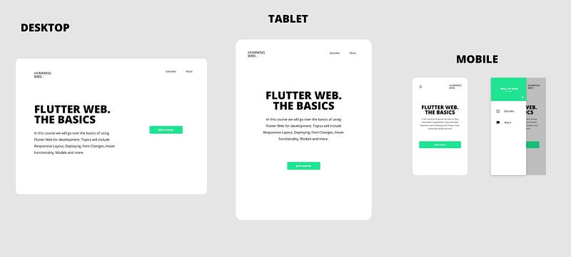
Suppose you are building an application compatible for the web, tablet and mobile platforms, you would ideally want to ensure that the user viewing your application has personalized views depending on the platform he/she wishes to use your application with.
Try viewing this website with your phone, or if on a web browser, resize the window, Link HERE. You wouldn’t want your application to be like this. Would you? If you are looking to lose your users then go ahead! 😉
However, if you do want your cross platform Flutter application to scale well just like this website, Link HERE, carry on reading this article!
First things first though, I would like to give credits to Filled Stacks, an amazing YouTube channel teaching you how to build production ready Flutter applications. Feel free to check the channel out. His content has most certainly helped me grow as a Flutter Developer.
The code for the BaseWidget(SPOILER ALERT!) class as well as defining breakpoints, which you will find below, have been borrowed from his tutorial. I’ve further decided to elaborate on it and add my own twist to it, to make it easier for the readers to understand and duplicate on their projects easily.
Responsive Design Pattern: A comprehensive definition.
Before getting into the folder structure, let’s formally define what a responsive design pattern is.
Simply put,
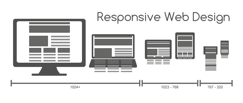
“Responsive Web design is the approach that suggests that design and development should respond to the user’s behavior and environment based on screen size, platform and orientation.”
The ultimate goal is to allow the users who view your application, a comfortable experience no matter which device or platform they use.
Responsive and Scalable Code Structure
Without any further delay, let’s get straight into the folder structure!
Given below is the basic layout of the folder structure.
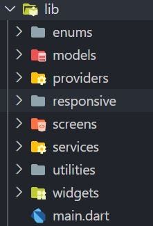
This folder structure encapsulates all what’s needed for a scalable Flutter project.
Let’s start from the top, shall we?
Enumerations
Enumerations are an essential part of a programming language. They help developers defining small set of predefined sets of values that will be used across the logics they develop.

enum DeviceScreenType {
  Mobile,
  Tablet,
  Desktop
}
This enumeration contains the three display types, i.e. Mobile, Tablet and Desktop.
Models
Models represent knowledge. A model could be a single object or it could be some structure of objects. More often than not, a model can be used to parse a JSON file and the data can be fetched in an organized manner throughout the application using Providers or any similar state management technique.

The first file above contains the Home View Model File:
import 'package:Flutter_Responsive_Folder_Structure/utilities/index.dart';

class HomeViewModel extends ChangeNotifier {
  String title = 'default';

  void initialise() {
    title = 'initialized';
    notifyListeners();
  }

  int counter = 0;
  void updateTitle() {
    counter++;
    title = '$counter';
    notifyListeners();
  }
}
The above file initializes the Home View class which as we will see below is vital to display the appropriate class pertaining to the user platform.
The other file contains the Theme Model:
import 'package:Flutter_Responsive_Folder_Structure/utilities/index.dart';

enum ThemeType { Light, Dark }

class ThemeModel extends ChangeNotifier {
  // Default Theme is Light Theme
  ThemeData currentTheme = lightTheme;
  ThemeType _themeType = ThemeType.Dark;

  // Toggling Current Theme
  // Can be toggled using Provider.of<ThemeModel>(context).toggleTheme()
  toggleTheme() {
    if (_themeType == ThemeType.Dark) {
      currentTheme = lightTheme;
      _themeType = ThemeType.Light;
      return notifyListeners();
    }

    if (_themeType == ThemeType.Light) {
      currentTheme = darkTheme;
      _themeType = ThemeType.Dark;
      return notifyListeners();
    }
  }
}
Most modern apps contain two versions, light and dark modes. I prefer dark mode obviously!😊
This model makes it easier for the developer to toggle the themes using provider, as shown in the comment above.
Providers
Provider State Management, which is recommended by the Google Flutter Team, mainly provides you a central point to manage the state of the application, and makes it really easy for the developers to share state and write front end logic closely connected to back end logic, thus enabling teams to work efficiently.

All the provider files would go under here, thus providing you a centralized location to manage all the state management processes in your Flutter Project.
Responsive
As the folder name suggests, this folder contains all the necessary files which handles the breakpoints for different views, and the main responsive design pattern logic.
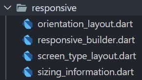
The first class returns the current device orientation, it is especially useful if you want to separate the views into two, one for Landscape and the other Portrait.
import 'package:Flutter_Responsive_Folder_Structure/utilities/index.dart';

class OrientationLayout extends StatelessWidget {
  final Widget Function(BuildContext) landscape;
  final Widget Function(BuildContext) portrait;
  const OrientationLayout({
    Key key,
    this.landscape,
    this.portrait,
  }) : super(key: key);

  @override
  Widget build(BuildContext context) {
    return LayoutBuilder(
      builder: (context, boxConstraints) {
        var orientation = MediaQuery.of(context).orientation;
        if (orientation == Orientation.landscape) {
          if (landscape != null) {
            return landscape(context);
          }
        }

        return portrait(context);
      },
    );
  }
}
As we can see, depending on the current device orientation, the Layout Builder returns the appropriate views for the same.
The next class which is the Responsive Builder handles the widget sizing properties relative to the current screen size using Media Query, thus painting the widgets appropriately. The Sizing Information is passed onto the next class which as we will see right below, splits the views depending on the user platform.
import 'package:Flutter_Responsive_Folder_Structure/utilities/index.dart';

class ResponsiveBuilder extends StatelessWidget {
  final Widget Function(
    BuildContext context,
    SizingInformation sizingInformation,
  ) builder;
  const ResponsiveBuilder({Key key, this.builder}) : super(key: key);

  @override
  Widget build(BuildContext context) {
    return LayoutBuilder(builder: (context, boxConstraints) {
      var mediaQuery = MediaQuery.of(context);
      var sizingInformation = SizingInformation(
        deviceScreenType: getDeviceType(mediaQuery),
        screenSize: mediaQuery.size,
        localWidgetSize:
            Size(boxConstraints.maxWidth, boxConstraints.maxHeight),
      );
      return builder(context, sizingInformation);
    });
  }
}
A fact (which is pretty obvious at this point), is that it is also essential to build views depending on the current device platform, i.e., Mobile, Tablet and Desktop. This is exactly what the next class achieves.
import 'package:Flutter_Responsive_Folder_Structure/utilities/index.dart';

class ScreenTypeLayout extends StatelessWidget {
  final Widget mobile;
  final Widget tablet;
  final Widget desktop;
  const ScreenTypeLayout({
    Key key,
    this.mobile,
    this.tablet,
    this.desktop,
  }) : super(key: key);

  @override
  Widget build(BuildContext context) {
    return ResponsiveBuilder(
      builder: (context, sizingInformation) {
        if (sizingInformation.deviceScreenType == DeviceScreenType.Tablet) {
          if (tablet != null) {
            return tablet;
          }
        }

        if (sizingInformation.deviceScreenType == DeviceScreenType.Desktop) {
          if (desktop != null) {
            return desktop;
          }
        }

        return mobile;
      },
    );
  }
}
Depending on the Sizing Information passed from the Responsive Builder class, the Screen Type Layout class returns the suitable platform.
Last, but definitely not the least, the next class is sort of a model; but is essential to the classes shown above. This class is responsible for the Sizing Information data, with respect to the user platform and is consumed by the above classes to extract the required screen sizing information.
import 'package:Flutter_Responsive_Folder_Structure/utilities/index.dart';

class SizingInformation {
  final DeviceScreenType deviceScreenType;
  final Size screenSize;
  final Size localWidgetSize;

  SizingInformation({
    this.deviceScreenType,
    this.screenSize,
    this.localWidgetSize,
  });

  @override
  String toString() {
    return 'DeviceType:$deviceScreenType ScreenSize:$screenSize LocalWidgetSize:$localWidgetSize';
  }
}
This sums up the all important responsive folder.
Screens
This folder contains all your screens and their widgets respectively. They are separated based on orientation, furthermore, split on the basis of the platform i.e., Mobile, Tablet and Desktop.
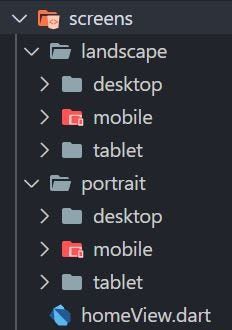
As we can see, the folder structure is pretty self explanatory. For now, I’ve loaded the folders with temporary Navigation Bar classes for each view, which for now, returns an empty container. Feel free to edit the class, or in fact start from scratch! It all depends on your design plans, so be creative!😃
This folder also contains the all important Home View class.
import 'package:Flutter_Responsive_Folder_Structure/utilities/index.dart';

class HomeView extends StatelessWidget {
  @override
  Widget build(BuildContext context) {
    return BaseWidget<HomeViewModel>(
      viewModel: HomeViewModel(),
      onModelReady: (model) => model.initialise(),
      child: ScreenTypeLayout(
        mobile: OrientationLayout(
          portrait: (context) => NavigationBarMobilePortrait(),
          landscape: (context) => NavigationBarMobileLandscape(),
        ),
        tablet: OrientationLayout(
          portrait: (context) => NavigationBarTabletPortrait(),
          landscape: (context) => NavigationBarTabletLandscape(),
        ),
        desktop: OrientationLayout(
          portrait: (context) => NavigationBarDesktopPortrait(),
          landscape: (context) => NavigationBarDesktopLandscape(),
        ),
      ),
    );
  }
}
The Home View class provides the entry point to all other classes in your project, as we will see in the main file, this class redirects the route depending on the current orientation layout for that platform. Depending on your project requirements, you may change the route to your specific classes as per your design purposes.
Services
The next folder is important, depending on if your app is connected to any backend database service such as Firebase. All the files required to fetch data from a database service goes here, and thus, separating both backend and frontend logic ideally.

Utilities
The utilities folder holds all imports as we can see in the index file, the routes, constants and so on. This is absolutely vital to keep your source code clutter free and easy to read and understand. This helps the developer to easily manage all the utility services at one place, especially during the maintenance phase of the development cycle.
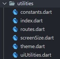
The constants file, holds all the constant design components reused throughout the application. Two sample constant variables have been provided in the file to provide you a template on how constants are written and can be called globally on any screen requiring that particular component.
import 'package:Flutter_Responsive_Folder_Structure/utilities/index.dart';


const kNavigationBarTextStyle = TextStyle(
  fontSize: 11.5,
  fontWeight: FontWeight.w600,
);

const konboardingtextdecoration = InputDecoration(
  labelStyle: TextStyle(
    color: Colors.white,
    fontFamily: 'Montserrat',
  ),
  labelText: "Email Address",
  fillColor: Colors.white,
  enabledBorder: OutlineInputBorder(
    borderSide: BorderSide(color: Colors.white, width: 2.0),
  ),
);
Next up, in my humble opinion, is one of the most important files which helps in achieving clean clutter free code. It’s the index file. All your imports go here, thus avoiding duplication and a disarrangement of imports at the top of every file. Please do note that, not all imports may be exported globally.
// Packages
export 'package:flutter/foundation.dart';
export 'package:flutter/material.dart';
export 'package:flutter/services.dart';
export 'package:provider/provider.dart';

// Dart Packages
export 'dart:io';

// Firebase

// Models
export 'package:Flutter_Responsive_Folder_Structure/models/themeModel.dart';
export 'package:Flutter_Responsive_Folder_Structure/models/homeViewModel.dart';

//Utilities
export 'package:Flutter_Responsive_Folder_Structure/utilities/routes.dart';
export 'package:Flutter_Responsive_Folder_Structure/utilities/screenSize.dart';
export 'package:Flutter_Responsive_Folder_Structure/utilities/constants.dart';
export 'package:Flutter_Responsive_Folder_Structure/utilities/uiUtilities.dart';
export 'package:Flutter_Responsive_Folder_Structure/utilities/theme.dart';

//Widgets
export 'package:Flutter_Responsive_Folder_Structure/widgets/baseWidget.dart';

// Responsive
export 'package:Flutter_Responsive_Folder_Structure/enums/device_screen_type.dart';
export 'package:Flutter_Responsive_Folder_Structure/responsive/responsive_builder.dart';
export 'package:Flutter_Responsive_Folder_Structure/responsive/sizing_information.dart';
export 'package:Flutter_Responsive_Folder_Structure/responsive/orientation_layout.dart';
export 'package:Flutter_Responsive_Folder_Structure/responsive/screen_type_layout.dart';

// HomeView
export 'package:Flutter_Responsive_Folder_Structure/screens/homeView.dart';

// Landscape
export 'package:Flutter_Responsive_Folder_Structure/screens/landscape/desktop/navigationBarDesktopLandscape.dart';
export 'package:Flutter_Responsive_Folder_Structure/screens/landscape/mobile/navigationBarMobileLandscape.dart';
export 'package:Flutter_Responsive_Folder_Structure/screens/landscape/tablet/navigationBarTabletLandscape.dart';

// Portrait
export 'package:Flutter_Responsive_Folder_Structure/screens/portrait/desktop/navigationBarDesktopPortrait.dart';
export 'package:Flutter_Responsive_Folder_Structure/screens/portrait/mobile/navigationBarMobilePortait.dart';
export 'package:Flutter_Responsive_Folder_Structure/screens/portrait/tablet/navigationBarTabletPortrait.dart';

// Services

// Providers
I’ve separated the imports even further depending on their type and the folder they belong too for your convenience. Hope this helps you out!
Next up is the routes file, and as the name suggests, holds all the routing logic for your application.
import 'package:Flutter_Responsive_Folder_Structure/utilities/index.dart';

class Routes {
  Routes._();

  //static variables
  static const String homeView = '/homeView';

  static final routes = <String, WidgetBuilder>{
    homeView: (BuildContext context) => HomeView(),
  };
}
For now the Routes class contains the route to Home View, which is the entry point to all other classes.
In order to get the current screen height and width, whether be it to responsively resize your image, or your container, this makes it easier to get the required information by just calling in the function and passing in the Build Context.
import 'package:Flutter_Responsive_Folder_Structure/utilities/index.dart';

Size screenSize(BuildContext context) {
  return MediaQuery.of(context).size;
}

double screenHeight(BuildContext context, {double dividedBy = 1}) {
  return screenSize(context).height / dividedBy;
}

double screenWidth(BuildContext context, {double dividedBy = 1}) {
  return screenSize(context).width / dividedBy;
}
Scaling the widgets with respect to the screen height and width is one of the most basic building blocks to responsive design.
For the theme model class mentioned above, we need a defined theme, through which you can style your Flutter projects. This is exactly what the below file contains.
import 'package:Flutter_Responsive_Folder_Structure/utilities/index.dart';

ThemeData darkTheme = ThemeData(
  brightness: Brightness.dark,
  accentColor: Color(0xffD83F89),
  appBarTheme: AppBarTheme(elevation: 0.0),
  backgroundColor: Color(0xff022140),
  scaffoldBackgroundColor: Color(0xff080F5B),
  primaryColor: Colors.white,
);

ThemeData lightTheme = ThemeData(
  brightness: Brightness.light,
  accentColor: Color(0xff06d755),
  appBarTheme: AppBarTheme(
    elevation: 0,
  ),
  backgroundColor: Color(0xff78ab8a),
  scaffoldBackgroundColor: Color(0xff78ab8a),
  primaryColor: Color(0xfffffffF),
);
For now, two sample themes for both dark and light modes have been given for your reference. Feel free to do the same, but this time using your own custom themes depending on your Flutter application!
The UI utilities file is pretty self explanatory. This file defines the breakpoints which your Flutter application adheres to while splitting up different views depending on the device or platform the user decides to view your application in.
import 'package:Flutter_Responsive_Folder_Structure/utilities/index.dart';

DeviceScreenType getDeviceType(MediaQueryData mediaQuery) {
  double deviceWidth = mediaQuery.size.shortestSide;

  if (deviceWidth > 950) {
    return DeviceScreenType.Desktop;
  }

  if (deviceWidth > 600) {
    return DeviceScreenType.Tablet;
  }

  return DeviceScreenType.Mobile;
}
Currently, the breakpoints are based on the size of the shortest side, which seems to be a suitable measurement of the breaking point. As we can see, this function returns the device screen type, using the media query passed in as an argument.
Widgets
The widgets folder, holds the common widgets between the screens mentioned above. This avoids duplication, as there would be reusable duplicate widgets between both the landscape and portrait orientation, and thus to avoid it, this approach is necessary.
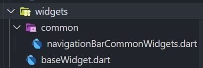
For now the common folder contains the common widgets of the Navigation Bar classes for each platform. For your Flutter project it maybe different, but nonetheless, the purpose of this folder remains the same.
The base widget class is needed to achieve the following:
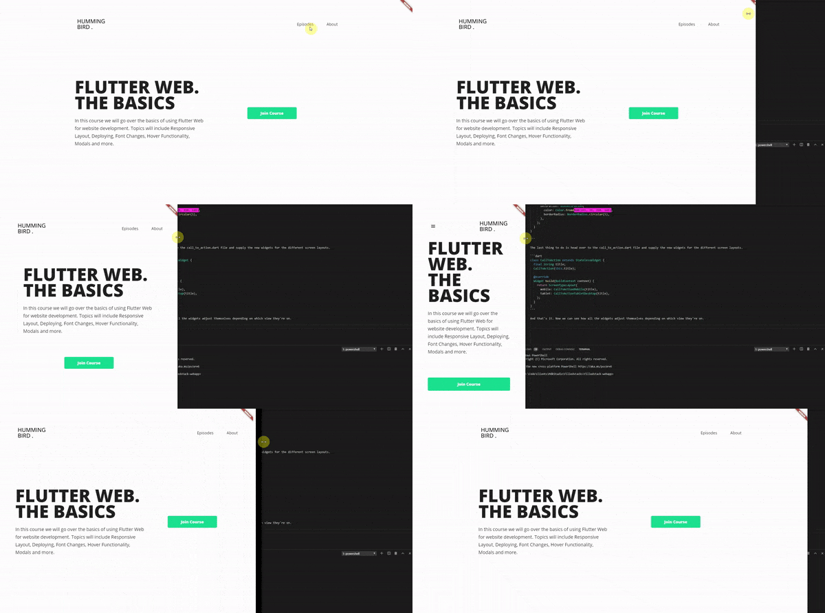
This class dynamically changes the design by altering the base class route depending on the screen orientation.
import 'package:Flutter_Responsive_Folder_Structure/utilities/index.dart';

class BaseWidget<T extends ChangeNotifier> extends StatefulWidget {
  final Widget child;
  final Function(T) onModelReady;
  final T viewModel;
  BaseWidget({
    Key key,
    this.child,
    this.onModelReady,
    this.viewModel,
  }) : super(key: key);

  @override
  _BaseWidgetState<T> createState() => _BaseWidgetState<T>();
}

class _BaseWidgetState<T extends ChangeNotifier> extends State<BaseWidget<T>> {
  T _model;

  @override
  void initState() {
    super.initState();
    _model = widget.viewModel;

    if (widget.onModelReady != null) {
      widget.onModelReady(_model);
    }
  }

  @override
  Widget build(BuildContext context) {
    return ChangeNotifierProvider(
      create: (context) => _model,
      child: widget.child,
    );
  }
}
As we can see, this class uses the Change Notifier Provider to dynamically respond the changes in screen dimensions globally throughout the Flutter Project.
Main
Let’s start at the top of the widget tree, the main file!
This is the intro point to any Flutter application. In order to correspond to the above responsive design architecture, as well as including a very useful package which will help developers to view real-time design changes based on the platform, few changes have been made to the default main file.
import 'package:device_preview/device_preview.dart';
import 'package:Flutter_Responsive_Folder_Structure/utilities/index.dart';

void main() {
  WidgetsFlutterBinding.ensureInitialized();
  runApp(
    MultiProvider(
      providers: [
        ChangeNotifierProvider<ThemeModel>(
          create: (BuildContext context) => ThemeModel(),
        ),
      ],
      child: DevicePreview(
        enabled: false,
        builder: (context) => MyApp(),
      ),
    ),
  );
}

class MyApp extends StatelessWidget {
  @override
  Widget build(BuildContext context) {
    return MaterialApp(
      builder: DevicePreview.appBuilder,
      title: 'Responsive Flutter Folder Structure',
      theme: Provider.of<ThemeModel>(context).currentTheme,
      initialRoute: Routes.homeView,
      routes: Routes.routes,
      debugShowCheckedModeBanner: false,
    );
  }
}
The Device Preview package allows you to resize your Flutter application based on different pre-built devices such as an iPad Air, or a medium sized Android Tablet. It also has a free form tool which allows you to customize the size and thus build your application accordingly.
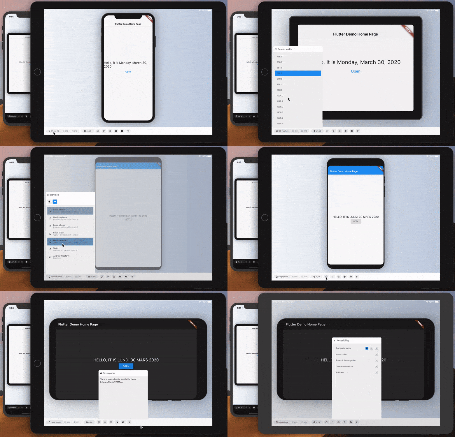
Furthermore, the initial route has been set to Home View, as we know it is the entry point which redirects the route to the respective class depending on the orientation. We also set the routes to correspond to the routes class.
This sums up our main file!
Conclusion
As we have gone in-depth to all the folders and classes in the above code structure, we have reached the conclusion of this article.
This being my first medium article, I sincerely do hope that this walkthrough has proven to be useful for all the readers!
Please do ask you queries below in the comments section, and I will get back to you as soon as possible.
The source code, as well as the folder structure is free to download and integrate in your Flutter projects. Please do check it out below, and give it a star if it helps you out, much appreciated!

